Why your website should be ugly
Most people (out side the industry anyway) assume that web sites should look good, and an aesthetically good website will produce better results than an ugly one. This is not true, and many of the things that make a website look good will tend to make it worse for users.
A lot of very successful websites are ugly. Look at Craigslist, for example. Its ugly, but it is very easy to use and it has content people want. That is what matters most. There are more examples and some discussion of the reasons why in this blog post from web analytics company Crazy Egg.
If you have really valuable content that people come looking for, you really need not bother about design at all, as shown by Warren Buffet's company Berkshire Hathaway.
On top of that a lot of successful sites became pretty after becoming successful - so the aesthetics are an indulgence of a successful business rather than what made a startup a success. Compare these screenshots of the old and new versions of Reddit:

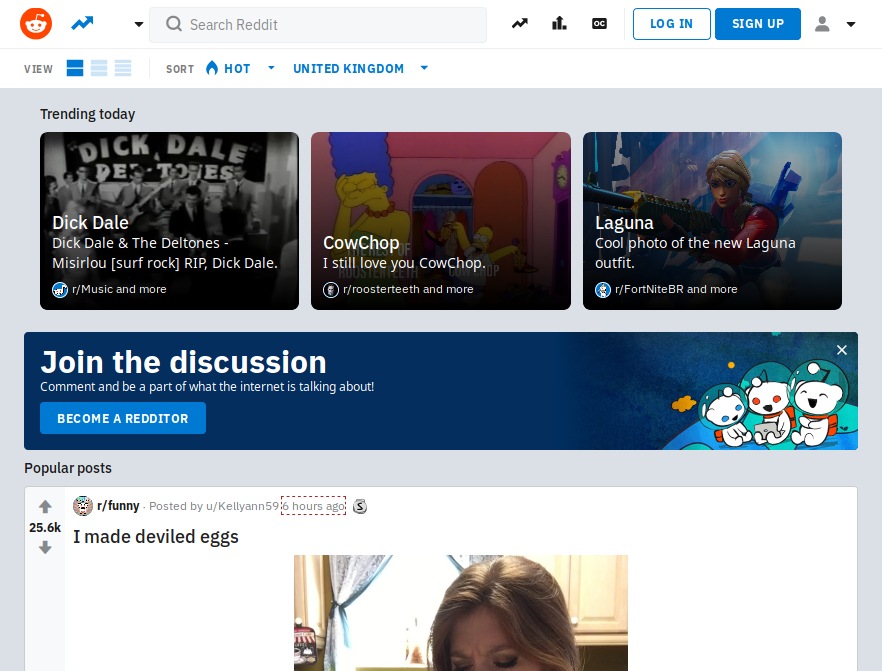
What makes these sites easy to use is, in many cases exactly the opposite of beautiful design: links and blue and text is black, lots of text and few images, and a spartan layout with few distracting elements. A site that looks exactly like a simple old fashioned site is a site everyone knows how to use.
Part of the problem comes from the general perception that websites are things that are designed, rather than software that is developed. Of course, this may be true if a site is something like a simple brochure site or a blog - although in most cases ease of use still trumps aesthetics. This is made worse by many websites being "done" by people with a graphic design background who are naturally biased towards aesthetically pleasing design and who understandably want a portfolio that shows off their design skills.
It is worsened by the tendency of business to favour what they like to see: people ask their staff, or their friends whether a site is good. This inevitably leads to favouring aesthetics over usability. If you really want to know how good your site is carry out tests and accumulate data. What do people click on? Can people carry out tasks (e.g. find and buy a particular product) easily? Run A/B tests, use analytics to track clicks, taps, scrolling and mouse movement. The gold standard would be to carry out eye tracking and task testing. That is expensive but there are cheaper proxies.
I am unconvinced by people who say their site needs to look good because they are selling luxuries or dreams. What your selling needs to look good. Certainly have great pictures of scenery on a holiday website, or or luxury goods, or whatever you are selling. Your customers care about that. What they do not care about is what you navbar looks like or whether your font is pretty.
Another problem that is not attributable only to the focus on aesthetics, but is related to it, is slow loading. Plenty of research and testing has been done and it is clear that slow loading pages are less likely to convert. There are a few numbers here but there is plenty more and the message is clear: adding a second, or even a fraction of a second to page loading times can hurt your sales. On top of that Google's algorithms consider page speed so a slower site will get fewer visitors to convert.
It used to be that the main problem was large images. These days it is usually slow loading Javascript. Every widget, every tracking script, every ad network slows your site down. Very often one script will load others from multiple sources. Its easy to add "functionality" this way, but its probably not what users want.
It all comes down to putting your users first.